Applied edition #04 Color and the five senses Part 1 Color preferences influenced by the five senses
Color preferences are determined by a complex set of factors. The effects of various factors have been mentioned in color research to date, so let's briefly list some of the most representative ones.
- The influence of climate, weather, natural features, and landscapes depending on the region and location conditions
Differences in sunlight depending on the Earth's latitude, differences in sunlight rate depending on geographical conditions, and the presence or absence of snow or the rainy season are said to have an influence, but even in Japan, differences in color preference are observed between the north and south. There are also research results. - Ethnic differences
This includes aspects such as the preference for colors that reflect well with skin and hair colors and the fact that they are often used, as well as the influence of differences in traditional culture, customs, customs, and religious teachings and practices.
When we look at the distinctive colors of housing and ethnic costumes in each region, we can strongly feel that lifestyle customs and cultural traditions have a strong influence. - influence of the epidemic
Effects of cyclical trends and changing times
The results of the annual color preference survey show that people's tastes are influenced by information they receive from magazines, TV, and now Instagram. - Effects of maturity on individual age and gender
Differences in preferences based on gender are often discussed. As you get older, you will see both changes in your tastes due to the influence of past experiences and changes in your interests, as well as a continuation of the tastes you acquired when you were younger. - Influence of sociality
The influence of knowledge acquisition through education and education, and the influence of differences in purchasing attitudes and judgment based on income
Differences in fields and cultures that individuals have come into contact with will be reflected in their preferences. Differences in income can lead to a richer experience, but it can also lead to biased information, leading to the formation of very unique preferences.
Research into individual preferences is always considered to be an essential theme in manufacturing and marketing.
From now on, we will have to continue to elucidate various aspects such as the culture and traditions of each region, individual attributes, and the results of learning. I think there has been a lot of research into differences based on class and income in the United States, but I think it can be said that there was not much need for research into differences based on income in Japan, which until recently was a country with a total of 100 million people in the middle class. Of course, it was recognized that the very few high-income earners had unique tastes, and fields targeting such people were not common. If anything, researching preferences in Japanese society, where people tend to be ``the same as everyone else'' and ``it's better not to stand out too much,'' may be easier to understand by exploring differences in ``sensibilities.''
In such research on Japanese sensibilities, we will summarize the results that have focused on the relationship with the five senses, from the research and analysis that has so far divided people into groups based on their preferred colors. This approach is based on the hypothesis that the five senses may have some influence on the formation of individual tastes.
Colors, of course, are perceived and recognized visually. In other words, it depends on the mechanism by which color information is received by the sensory organs. Is there any relationship with other senses? When we see a color, we instantly imagine a soft image or a hard image, and this is thought to be a reaction from the accumulation of experience gained through the sense of touch.
Therefore, I decided to take a look at the relationship between the tendency of preferred colors, the sensitivity to self-judged information, and the sensitivity of the five senses.
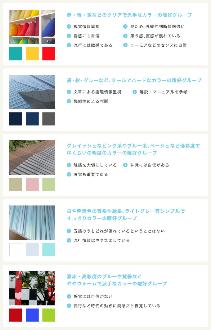
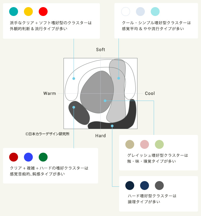
Looking at these results, it seems that people who prefer colors that are highly saturated and easy to understand at a glance tend to feel that they are more responsive to visual information and have a better sense of trends. They are confident in their pitch, intuition, and even sense of humor, and tend to view their senses and sensibilities positively in all aspects. You can also read positive and extroverted tendencies. On the other hand, it is interesting to note that the group that answered that they are not confident in their sensibilities and are ignorant of trends also prefer somewhat similar flashy colors.
On the other hand, people who prefer colors with low saturation tend to have more confidence in their senses and sensibilities, such as touch, taste, and smell, which judge differences in quality rather than information that can be seen at first glance. This result seems to be similar to the age theory and the culture theory of taste, as people with a variety of experiences and those who have acquired a culture tend to prefer calm colors.
Based on this, we may be able to consider ways of visual expression and packaging for people who are picky about taste, such as reducing the saturation and promoting quality.
People with cool-hard tastes have little interest in sensibilities and sensations, and seem to need information that clearly explains things, such as manuals and logical explanations. It can be said that I am the type of person who is not satisfied with visual appeal alone.
It is certain that the survey method of asking people to answer by looking at color samples is influenced by the era at the time of the survey, so it cannot be said that the results of one survey will be valid in any era. By sorting out the relationships between tastes, sensibilities, and trends, you may be able to find ways to appeal to your target audience.
November 30, 2016
Text by Japan Color Design Institute
Share