Applied Edition #05 Color and the Five Senses Part 2 Touch
Japanese lifestyle culture that fosters the sense of touch
People live their lives by using their five senses to detect danger and relax, but each person's senses are different, and it can be difficult to convey what they feel.
If we compare these five senses to colors, we can visualize them and be able to infer how other people are feeling.
This time I would like to take a look at the sense of touch. One of the things I was once taught when traveling abroad was to "never touch products without permission." Growing up in Japanese culture, many people seem to have developed the habit of checking things by touching them as soon as they enter a store. For example, we hold tableware in our hands when we eat, so we feel its texture every day; the climate is hot and humid and dry in winter, so we often suffer from repeated sweating and drying; and the texture of clothing materials. Some people may be particular about it.
Nowadays, more and more people are making judgments based on videos and images, so more people may be able to make judgments based on appearance without actually experiencing the touch, but the habit of understanding things like texture by "touching" is still strong. I think there is something there.
Words that express tactile sensations - onomatopoeia
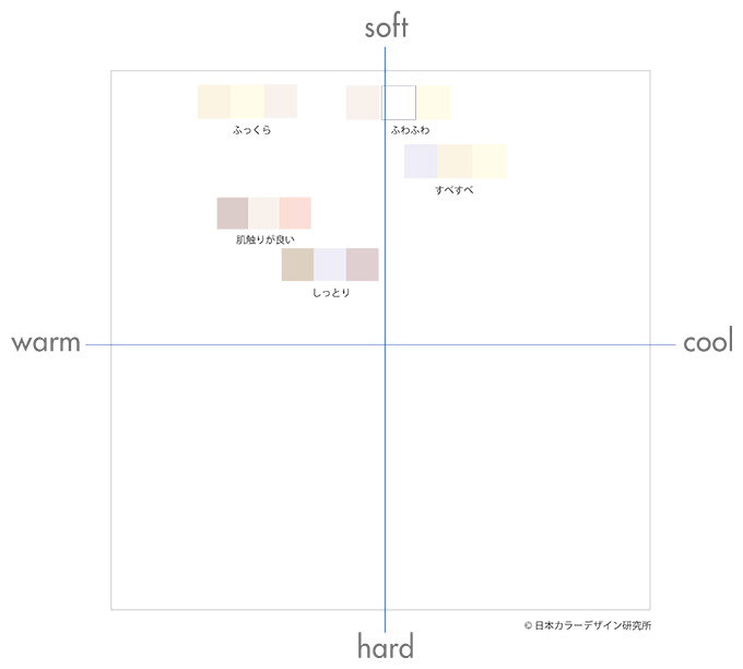
First, let's take a look at an example using color schemes.
I replaced the words that describe the feel of the product with a three-color scheme. These are the results of the workshop. Rather, I tried to focus on words that describe a "feeling" sensation.
You can see that it is concentrated in the soft zone and the central calm zone. It seems that a very pale Vp (very pale) tone is important. It can be said that a pleasant tactile sensation is symbolized by a light tone of color. Also, yellow and yellow-red are important hues. Probably because it's close to my skin color. It's a hue that conveys warmth.
Comfortable texture based on color
Next, let's take a look at an example in which a sample of a single color was asked whether it felt comfortable or unpleasant to the touch.
This is a quote from the results of "Image Survey on Colors, Five Senses, Psychology, etc. - Tohoku University of Art and Design" 2013 by Chikara Kubota, Satoshi Watanabe, and Akiko Sugiyama. (The color sample used for the answer is a table consisting of 28 representative hues and tones.) Let's take a look at the trends of the top colors.
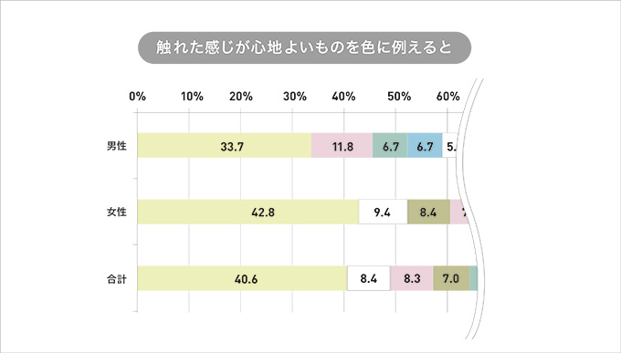
The results seem to be similar to those from the workshop. Both men and women choose pale yellow most often. This was also seen in the color scheme, but it can be said that one of the characteristics that was chosen as a single color was that many people chose white.
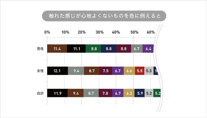
On the other hand, colors that are uncomfortable to the touch include darker colors such as black, brown, and gray, as well as achromatic colors other than white. Although this may be a very simple result, it can be said that a common opinion regarding tactile sensation was once again sought.
Products that require a comfortable texture
When it comes to products, there may be areas where colors that convey a good tactile sensation are important. It comes into direct contact with the skin. Typical examples include underwear, bedding, and cosmetics. It can be said that these fields have focused on and appealed to the quality of their products. Of course, various colors and designs have been developed to suit various lifestyle situations and tastes, but basic products seem to continue to be available in colors that are ``comfortable to the touch.''
Everyone, please check the colors of everyday household items.
Product/package design that appeals to good tactility
The color of the product is a very light tone, and the packaging has a slightly more pronounced tone, which conveys the softness and quality of the product when it touches the skin. It can be said to be a very important element in tissue paper and toilet paper products.
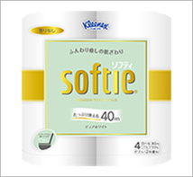
<Product color pure white>
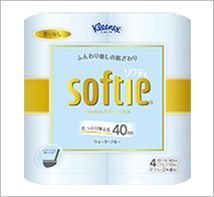
<Product color water blue>
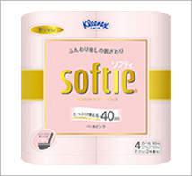
<Product color pale pink>
Kleenex Softy 4 Rolls (Double) Nippon Paper Crecia Co., Ltd.
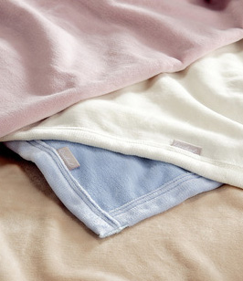
Even in bedding, color is one of the selling points. It is comprehensively considered, along with the quality of the material and seasonal temperature.
The bright, slightly grayish tone makes you feel comfortable when you are wrapped in softness, and it seems like you will have a happy sleep time.
March 22, 2018
Text by Japan Color Design Institute
Share