Basics #04 Tools for mastering color images / Color image scale
As you may well know, the phrase ``ten people and ten colors'' refers to the fact that people have different ideas, preferences, and characteristics. Color preferences are truly diverse, and when we hold a workshop where people choose their 10 favorite colors, it seems that no two patterns are exactly the same. For this reason, many people come to the conclusion that color evaluation is subjective.
However, even though at first glance it may seem like people have different color preferences, when you sort it out, you can find commonalities in their tastes, such as a preference for bright colors or a preference for bright colors. It is also known that many people view the impression effect that they feel when looking at colors from the same perspective. As a result of accumulated experience and learning through the five senses, such as seeing, touching, and holding things in your hands, there are parts of you that feel the same way when you look at colors.
Learn the basic images of colors and use them to your advantage.
The color image scale was developed to clarify the meaning (image) of each color, correlate each color with each other, and make comparative decisions. All colors are positioned in an image space consisting of three psychological axes: warm or cool, soft or hard, and clear or grayish. I am.
- Image scale 2D type or 3D type posted, text corrected depending on the type of publication.
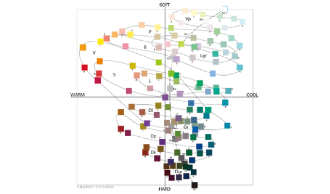
The farther apart the colors are on this scale, the greater the difference in the image. On the other hand, colors that are close to each other can be said to have similar images.
Highly saturated colors have a large spread along the horizontal axis. This shows that vivid colors can greatly change the image depending on their hue. In comparison, it can be seen that dark colors that are close to black are concentrated in the direction of hardness, but they have a strong impression of hardness, and the difference due to hue is not well recognized. . In other words, if you use a dark color, it is easier to express the same sense of dignity and formality in both red and blue colors.
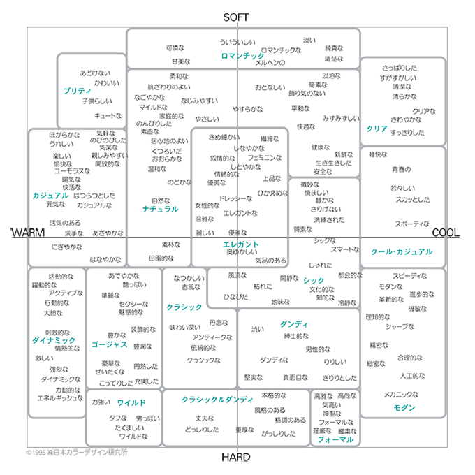
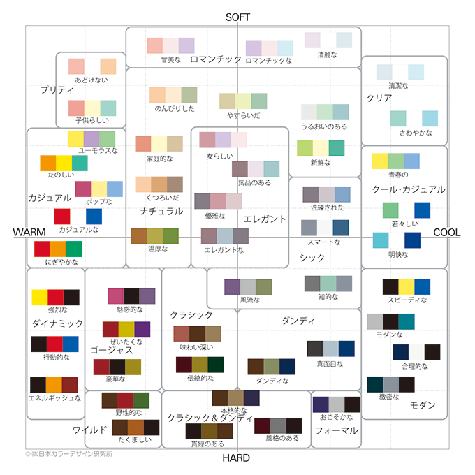
This scale has been developed in association with adjective images and color scheme images. For example, a single color or color scheme that expresses the content of each adjective is a color or color scheme that is located at the same position on the image scale. On the other hand, to find out what kind of impression a color combination conveys to people, all you have to do is look for adjectives that appear in similar positions to the color combination.
Using this language scale also helps organize concepts.
"This new model respects tradition, aims to create warm connections between people, and is more advanced."
It would be quite difficult to come up with a design or color based on this concept. As it stands, it's hard to know which colors to give priority to: colors that give a sense of tradition, colors that give a sense of warmth, and colors that give a sense of innovation. You might think that such a concept would not normally be created, but surprisingly there are many concepts that have a lot of variety.
But there's no problem. If you try again using the adjectives listed on the image scale and replacing them with multiple adjectives, it will become clear where the emphasis was placed and what is commonly recognized.
People's opinions vary. However, there are some things that can be shared in common. Image scale is useful for summarizing such various opinions. It is also a tool that allows you to read the content, quality, and information being transmitted by looking at the color scheme.
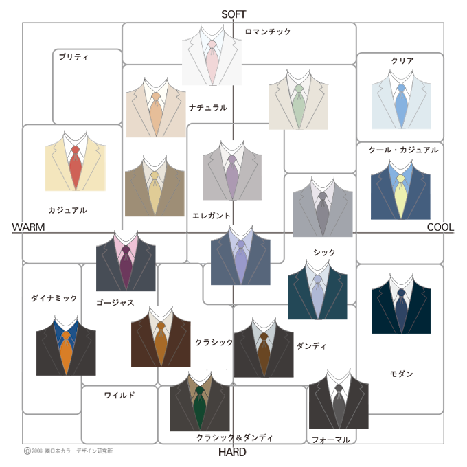
As a simple example, we will introduce an image scale based on the color of a businessman's chest and V-zone. This is where the power of communication through color can be utilized. The color scheme shown here is not the only one that has this image, but using this scale as a reference, you can use bright and soft shades of blue to give a clear sense of cleanliness, or use a purple or pink tie to create a sense of cleanliness. I would like you to grasp the basic rules and apply them, such as how incorporating them can create an elegant and gentle impression. Of course, please consider the balance with your own character image when incorporating it.
“Color image that conveys the heart” 2008 Kodansha (with some corrections)
Reference books: "Color Image Scale Revised Edition" 2001 Kodansha, "Color System" 1999 Kodansha
August 31, 2015
Text by Japan Color Design Institute
Share