Basics #06 Harmony of color scheme
Some people may say that they are not good at color combinations. There are so many colors, so if you try to use them all, it's natural that you won't know what to do with them. So let's think of the easiest way possible.
Various theories have been proposed for a long time regarding the harmony of color schemes. The trend is that it is difficult to come up with a theory that can show or explain ``absolute harmony'' and ``universal beauty through color combinations.'' In fact, when I once held a color scheme study group with people in the kimono industry in Kyoto, I found differences between evaluations in Tokyo and Kyoto, and differences between those involved in the kimono field and the general public. . It was inferred that regional differences and differences in experience and learning influenced the evaluation.
However, as we continue to hold workshops where we create color schemes and vote on them, we learn that the relationships among the three attributes of hue, brightness, and saturation, as well as the order of arrangement and arrangement, are based on methods common to many theories. There is a clear tendency for combinations to be selected that take into account "some kind of order."
In order to actually master the use of colors, the way you combine colors can increase your favorability and make a difference in sales, so you need to work hard on it.
So let's consider representative harmonization theories and their validity.
Cheuvreul's theory of harmony (France 1786-1889)
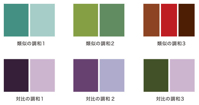
He proposed the idea that there are two types of harmony: similarity and contrast. It is considered as the basis of color scheme.
- Harmony of Similarity 1 - Combinations of approximately the same hue are harmonious.
Harmony of Similarity 2 - Combinations of similar hues and lightness and saturation are harmonious.
Harmony of Similarities 3 - Colors that have common color components, as seen through colored glass, harmonize. - Harmony of Contrasts 1 - Colors of the same hue but contrasting in light and dark are harmonious.
Harmony of Contrasts 2 - Colors that are contrasting in light and dark in adjacent hues are harmonious.
Harmony of Contrasts 3 - Colors that are very far apart in hue and have contrasting lightness and saturation are harmonious.
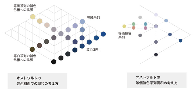
Ostwald's theory of harmony (Germany 1853-1932)
The idea that harmony equals order
- Gray Harmony - Three grays harmonize when they are equally spaced.
- Harmony on equal hue planes - Colors on the same hue plane are harmonious. There are three types: those with the same white content, the same black content, and the same white and black content.
- Harmony in colors of equal value - Colors with equal content of white and black (colors on a ring cut by the horizontal plane of the color system) harmonize.
- Harmony between complementary colors in a diamond shape - On a diamond shape made up of two complementary hues, a combination of colors with equal content of white and black will be harmonious.
Moon and Spencer's theory of harmony (published in the United States in 1944)
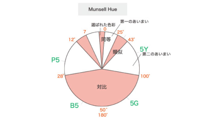
- For two-color combinations, we considered equal harmony, similar harmony, and contrasting harmony based on the positional relationship in the color space, and other areas were considered inharmonious because they were ambiguous.
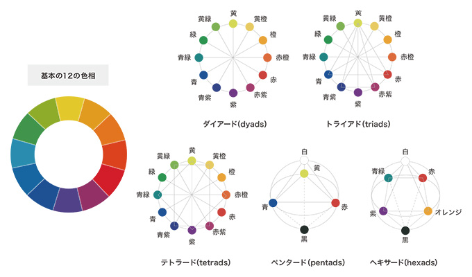
Johannes Itten's theory of harmony (Switzerland 1888-1967)
In charge of color theory at Bauhaus. We advocate harmony based on the positional relationship of our unique 12 colors on the color wheel.
- Two-Color Diad - Complementary colors in opposite positions harmonize.
- 3-color triad - The positions of equilateral triangles and isosceles triangles are harmonious.
- 4-color hexard -- the positions of squares and rectangles are harmonious.
- 5 Colors Pentard - Triangle with white and black added
- 6色 テトラード――四角形に白と黒を加えたもの
Judd's theory of harmony (USA 1900-1972)
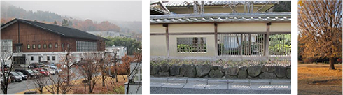
A summary of the common parts of the harmony theory so far (Photos are reference examples corresponding to each principle - Photo by Akiko Sugiyama)
- Principle of Order: Colors that are combined according to rules within a color space are harmonious.
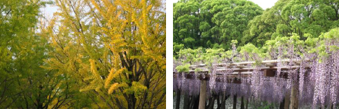
- Principle of Familiarity - Familiar combinations, especially those found in nature, harmonize.
- Principle of Similarity - Color combinations that have common elements or properties harmonize.
- Principle of Clarity: Differences are more harmonious than ambiguous combinations that are too similar.

Let's reconsider the common parts of the above color theory.
It is easier to harmonize by using the rules and order in color space.
In display training, when a large number of different colors are arranged in the order of the color wheel, there is a tendency for more people to rate them as ``beautiful.'' Sorting by brightness is also likely to be popular. Looking at this situation, it can be said that combinations that utilize the rules on the color space of the color system create a sense of order and are likely to lead to good impressions.
Familiar colors tend to create a positive impression.
I call it ``color shock'' rather than culture shock, but when you go to another country, do you ever feel like there are so many strange color combinations? Each country has its own color combinations that are commonly used, and when you encounter the colors of the region where you grew up, you feel relieved, but when you see the colors used in other regions or countries, you may feel strange or strange and feel uneasy. However, on the other hand, there are cases where that "exotic feeling" becomes admiration and attraction. After all, it can be said that the charm of color combinations is not simple.
Coloring techniques can be broadly divided into two types: similarity and contrast.
All theories discuss common color combinations and contrasting color combinations. Broadly speaking, I think it would be a good idea to use it as a technique for harmonizing the color scheme.
Colors that contain similar shades of gray tend to harmonize with each other.
As a common element, relationships such as the same hue or adjacent similar hues are also important, but colors with the same combination of white and black will be easier to harmonize as colors with the same tone.
It is easier to harmonize if the differences are clear beyond a certain level.
Although Moon and Spencer's theory of harmony is not considered to be very practical, the idea that colors that have ambiguous relationships on the color wheel are inharmonious is based on the idea that there are color combinations that are difficult to obtain favorable impressions or aesthetic evaluations. Let's say it shows. This may be a relationship that some people may find uncomfortable. According to Judd's theory, being too similar can lead to disharmony. It seems like a good combination of colors while keeping each one clearly recognizable.
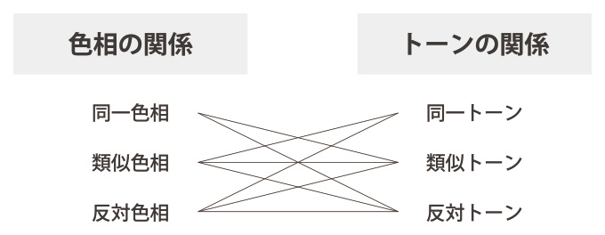
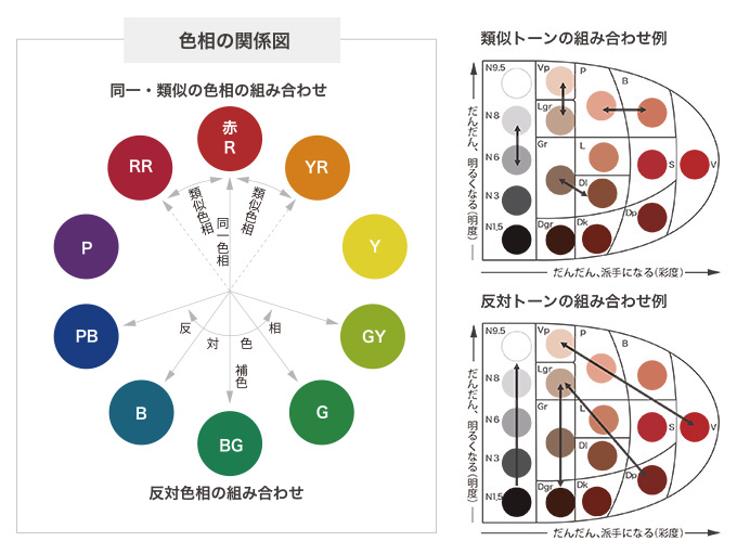
Color scheme considered from hue and tone as a summary of color scheme harmony theory
Based on the above, I would like to introduce a simple color scheme based on theory and practice. The diagram below is organized using the NCD HUE & TONE system, which is based on the Munsell color system.
First, let's organize the techniques in terms of their position in the color space. There are eight possible combinations of hue and tone relationships.
Furthermore, the key to making full use of color schemes is not only to ensure that the color combinations receive good impressions and aesthetic evaluations, but also to consider what kind of presentation and effect they will ultimately give to spaces, products, packaging, etc. There is. In practice, it is important to use them appropriately depending on the time and place, purpose, and purpose.
Broadly divide your coloring techniques into harmony of similarity and contrast, and pay attention to the differences in their effects.
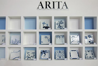
Cases of similar harmony
Tableware Festival Arita Ware Booth
square dinner plate
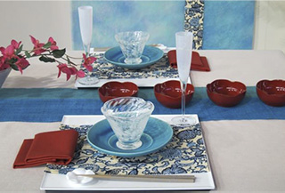
Case of harmony of contrasts
Tableware Festival 2014
Exhibited works Megumi Ohira
| Similarity (homogeneous color scheme) | Contrast (heterogeneous color scheme) | |
|---|---|---|
| Color space relationship | unity Combinations of the same/similar hues and tones |
Kiwadachi Combinations of distant colors such as complementary colors, opposite hues, and opposite tones |
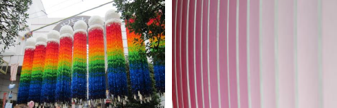
| Main tone direction with multicolor color scheme | tone color scheme A color scheme that takes advantage of differences in tone (brightness and saturation). Use the same or similar hues to create a sense of unity. |
hue color scheme A color scheme that makes use of many hues to create a sense of movement and liveliness. The tones are the same or similar to create a sense of order. |
| Arrangement/arrangement | Gradation An arrangement that gradually changes according to the rules in color space. It also reminds us of changes in the natural world. |
separation An arrangement that divides with contrasting combinations. |
| Relationship with area | Keynote/Large area | Emphasis/Small area |
| production effect | Orderly, quiet, and show off the texture of the materials | Show off liveliness, richness, and pattern |
| Usage scene | Long-term/daily/ke | Short-term/Festivals/Events/Hare |
●Hue ●Tone ●Similarity (same quality) ●Contrast (differentness) This is an easy color scheme if you focus on these four points.
In addition, evaluations of color schemes are influenced not only by regional differences but also by differences in individual tastes. In this case, it is possible to capture not only the preference for hue, but also characteristics such as those who tend to prefer similar types and those who prefer contrasting types. People who like clarity in things and people who have a sporty lifestyle tend to prefer contrasting types, and people who prefer quietness tend to prefer similar types. Evaluations will vary depending on.
I would like you to take these considerations into consideration when creating an effective color scheme.
April 21, 2017
Text by Japan Color Design Institute
Share